Why clients don't fill out your intake forms
Why clients don’t fill out your intake forms
You made a nice intake form. You sent it to your client. They said “I’ll fill this out today.”
That was two weeks ago.
I’ve been there. And after years of experimenting, I think I know why forms get abandoned.
It’s too long
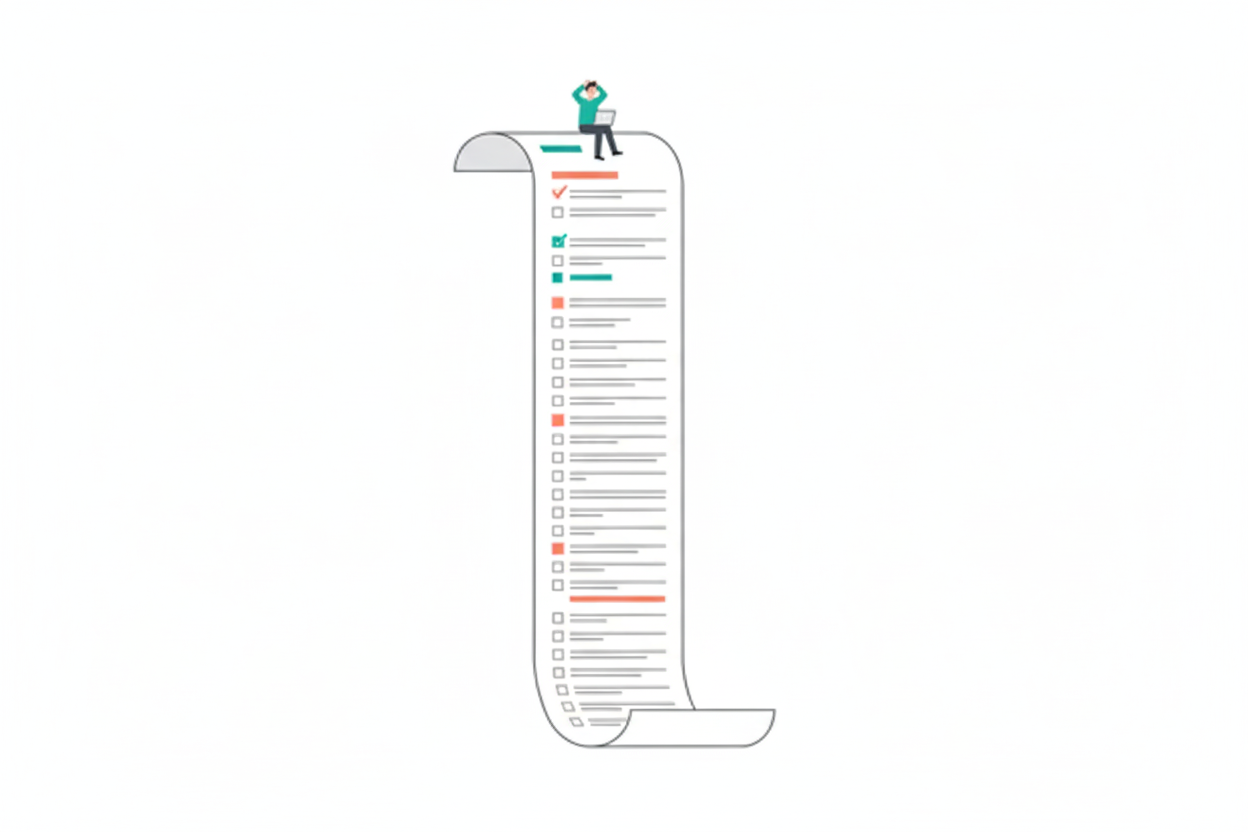
Nobody wants to see a 47-question form. Even if every question is “necessary,” that wall of fields is intimidating. The client opens it, scrolls down, goes “ugh,” and closes the tab. They’ll do it later. (They won’t.)
What works better: Keep it under 15 questions if possible. If you genuinely need more, break it into sections so they can tackle it in chunks. Let them save progress and come back.
The questions are confusing
“Please describe your brand positioning relative to competitors in your market segment.”
What?
Your client isn’t a branding expert. That’s why they hired you. If they have to stop and think “what does this even mean?” for every other question, they’ll give up.
What works better: Write like you’re texting a friend. “Who are your main competitors? What makes you different from them?” Simple words. Short sentences.
There’s no deadline
“Fill this out whenever you get a chance” = never.
People need a little pressure. Not aggressive pressure. Just enough to make it a real task instead of a vague intention.
What works better: “Can you fill this out by Friday? I need the info to start the project next week.” Now there’s a reason to actually do it.
They can’t find it
The link is buried in an email from three weeks ago. They meant to bookmark it. They didn’t.
What works better: Send a reminder with the link again. Don’t make them dig through their inbox.
It feels like homework
Let’s be honest: filling out forms is boring. It feels like paperwork. Nobody’s excited about it.
You can’t make it fun, but you can make it less painful:
- Prefill anything you already know
- Use multiple choice where possible (clicking is easier than typing)
- Thank them when they’re done — a little acknowledgment goes a long way
The real issue
Most of the time, the problem isn’t that your client is lazy or disorganized. The problem is that your form created friction, and friction kills completion.
Every extra field, every confusing question, every missing save button — they all add up. Eventually the form joins the pile of “things I’ll get to later.”
Make it shorter. Make it clearer. Send reminders. That’s really it.
We obsess over this stuff at equest. Auto-save, progress indicators, clean design. The boring details that actually matter.